Do shoppers really ‘decide’ to buy products? According to Harvard Business School professor Gerald Zaltman, up to 95 percent of all cognition occurs in the subconscious mind.
When we weigh up a purchase, there are countless mental processes at work in the background. Retailers have been influencing these processes long before neuroscientists figured out what was actually going on.
The human brain was not designed to navigate the retail environment. But the retail environment has been carefully crafted to navigate the peculiarities of the human brain. This is why, when we encounter a perfectly designed retail display, we are in a sense helpless. A great display taps into our brains at the deepest level. From this point the subconscious takes over and guides us towards purchase.
One of the most important psychological techniques is the use of colour. It’s integral to visual marketing and can make the difference between a sale and a fail. Here’s how to make the first and most important decision of any retail display—which colours to use.
Wield the rainbow: the quick guide to selling with colour
Our perception of colour and the emotional response it triggers is underpinned by biology and strongly influenced by culture. All colours have positive and negative associations—context is critical. Below is a quick reference point to evoke the right mood for your products:
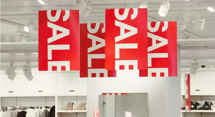
Red. Red means danger. But it also means sex and vitality. Either way, it grabs attention. It’s also associated with sales—so ideal if you really want to push a product.
Orange. Warmth, happiness, fun. A truly energetic colour. What’s not to love?
Yellow. Sunshine, confidence, wealth. Trade up to gold to really emphasise the latter.
Green. Nature, environmentally friendly, peace. Also associated with envy—maybe not such a bad thing if used on your premium products!
Brown. Calm, reliable, traditional. Can also be dull or dirty, so apply with style.
Blue. Intelligence, efficiency, professionalism. Blue can be cold and corporate though, so use sparingly or in a natural context.
Purple. Luxury, quality, wisdom. Purple is also associated with royalty, but can be gaudy is overused.
Pink. Femininity, health, love. Pink used to be a masculine colour and maybe it will be again, but it’s a long way off yet!
Black. Glamour, sleekness and sophistication. The ideal choice to promote your top shelf products.
How do you apply these principles to your retail displays? Below are some ideas to guide you:
Use sex and danger (or just red) in your window displays
It’s war on the high street. You’re fighting with every other store for shoppers’ attention, so why not pull out the big guns?
Red screams “Look at me!”
Red is arguably the most important colour in nature. We can’t fail but be drawn to it—a useful weapon to have when designing your next window display. If you prefer the more subtle approach but don’t want to sacrifice too much pulling power, tone it down a touch with other energetic, less in-your-face, colours like orange and yellow.
Blues and greens on the other hand tend to chill people out. Maybe not the best thing for your first line of attack—unless you’re selling the idea of summer with azure seas and palm trees.
Contrast your retail displays. Change it up in store
You can have too much of a good thing. Turning your retail displays up to 11 all the time will wear your customers out. Break up and contrast colours in-store and tailor the mood to your products. See the next section for some tips. Don’t forget the background. Choose neutral colours like beige and white to avoid clashing with your displays. Alternatively, choose complementary colours (colours opposite each other on the colour wheel) for maximum contrast.
Contrast can also apply to the shop window. If everyone is going super bright, why not go dark? Brands like Hollister have used this technique to good effect—dimming the lights and creating enigmatic shop fronts that generate a sense of curiosity and desire to find out what’s inside.


